Hemden Design Hemden Design
Web Design 6 min read

What is Responsive Web Design?

Ensuring seamless cross-device experiences across Desktop PC, iPad, and Mobile screens with zero layout degradation.

Hemden Design Team
Hemden Design Team
Front-End & UI Engineering
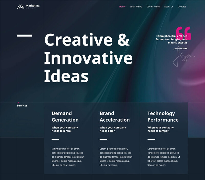
Multi-device Responsive Web Design Showcase

What is Responsive Web Design?

Responsive Web Design (RWD) is a front-end engineering methodology ensuring that web pages render with flawless proportion and ergonomics across any device and viewport size—from massive 32-inch 4K desktop monitors down to compact smartphones.

Instead of maintaining clumsy, disconnected subdomains (such as legacy "m.example.com" sites), RWD utilizes a unified codebase that fluidly reshapes itself to honor the physical ergonomics of each screen.

Why Responsive Design is Imperative for Modern Brands

User expectations are unforgiving. If a prospective client loads your website on their iPhone and encounters tiny, unreadable font, cut-off tables, or buttons that require awkward pinching and zooming, they bounce in under three seconds.

  • Enhanced User Experience: Smooth browsing without pinch-zooming or horizontal scrolling.
  • Capturing Mobile Commerce: Over 65% of global commerce inquiries originate on phones.
  • Strict Google Mobile-First Indexing: Google strictly ranks sites by their mobile performance.

The Three Technical Pillars of Modern RWD

True responsiveness is engineered through mathematical fluid units rather than arbitrary fixed pixel widths. We combine modern CSS Grid, Flexbox, and CSS clamp() expressions to achieve natural visual scaling.

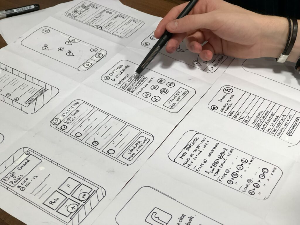
Blueprint Diagram of Fluid Grids, Flexible Images, and Media Queries
The three technical tenets of responsive web architecture: Fluid Grids, Flexible Media, and Media Queries.
  • Fluid Grid Layouts: Dynamic percentage and fractional grid scaling.
  • Flexible Media: Modern WebP/AVIF images with srcset and responsive picture elements.
  • Media & Container Queries: Surgical breakpoint logic tailored to component boundaries.
Tags: #Responsive Design #RWD #Mobile-First #CSS Grid #Google SEO

FREQUENTLY ASKED QUESTIONS

Direct answers to key inquiries regarding strategy, implementation, and ROI.

RWD is a modern front-end approach where a single codebase automatically adapts page layouts, typography, and media to provide optimal viewing across desktop, tablet, and mobile devices.
Over 65% of all web traffic is mobile. A non-responsive site causes high bounce rates, frustrates customers, and gets penalized heavily by Google's mobile-first search algorithm.
The three foundational pillars are fluid CSS grid layouts, flexible responsive media that scales proportionally, and CSS media queries that adjust styling across viewports.
Google uses mobile-first indexing to evaluate all websites. A responsive site prevents duplicate content issues, loads faster, and passes Core Web Vitals with flying colors.
It eliminates awkward zooming, horizontal scrolling, and overlapping touch targets, allowing visitors to navigate effortlessly and convert with confidence.

RELATED INSIGHTS

Continue exploring related methodologies and technological perspectives.

View All Insights→
Minimalist Editorial User Interface with Clear Typographic Hierarchy
Design Systems
Design Systems · 6 min read

What is UI/UX Design?

UI crafts visual emotion and typography; UX engineers seamless navigation and conversion paths. Discover the full UI/UX design workflow.

#UI/UX Design #Design Systems #Figma Prototyping
Hemden Design Team Hemden Design Team
Read →
Bespoke Studio Partnership

Ready to build high-performance digital products for your brand?

Whether migrating from legacy platforms, designing tokenized UI/UX systems, or deploying AI automations, Hemden Design engineers bespoke solutions with zero bloat.